Heat Check: Creating Shot Maps
SEPTEMBER, 2022
Introduction
Shot maps are one of the basic yet powerful data visualization techniques used in basketball analytics. When done right, they’re straightforward and paint a clear picture of how well where a player shoots from various regions, which has obvious applications for coaches and scouts.
Unfortunately, the NBA restricts public access to the majority of shot tracking data that would make shot maps much simpler to generate, so I created a workaround that complements manual shot tracking.


Case Study
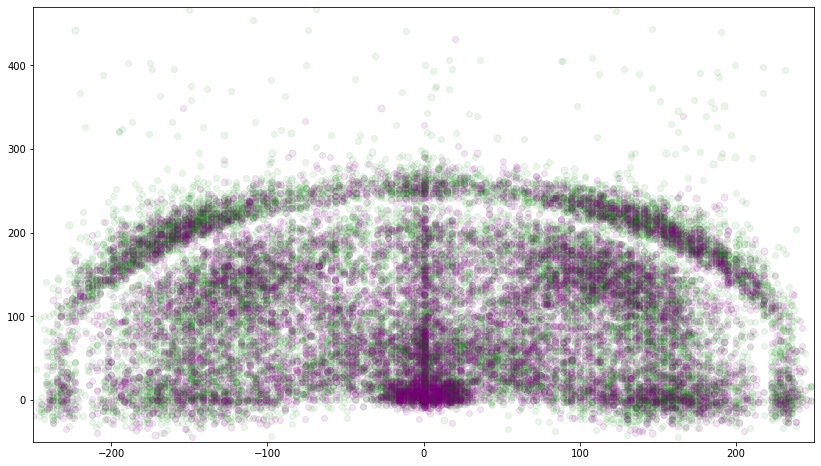
First of all, the different colors really don’t tell much of a story, and we don’t get any sense of hot zones. We can’t tell where the paint is, and while we can estimate, we can’t tell where the 3-point line is either.
Shot Regions
Let’s assume we have zero precision on shot locations; all we know is its region. After splitting up the court as shown here, all we need to track in real-time is the region and outcome of each shot, simplifying data collection methods.
For example, PLAYER missed from the Left Wing.

Sample Data Collection
The one step I skipped over is the one that actually allows me to generate a chart like this. In the absence of coordinate data, there’s no intuitive way to map shots based on region alone, so I essentially created my own map in R. For example, the left wing constitutes a defined set of coordinates that satisfy various inequalities (e.g. y > 14), and by assigning a region to each shot, I am effectively recreating an artificial coordinate system, of which there are only 9 options.
Instead of recording a shot that was taken exactly 1 foot to the right and 2 feet up from the left corner, I record “Left Corner” instead and my program knows to read this as a shot taken from the Left Corner region. A sample of 10 rows is shown here.

The Final Product


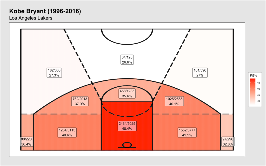
As a contrast, I used the same dataset here as the original case study above. There are no discrepancies over where a shot was taken from since the black lines serve as definite borders, and the labels and shaded regions clarify Kobe’s relative hot zones. One takeaway is that outside of the corners, he was not a great 3-point shooter, though the next step would be to adjust for league averages to compare relative efficiencies. As a visual aid, the table ranks each region by FG% and restates Kobe’s shooting splits.
Conclusion
Shot maps are great tools to be used by coaches and scouts for a variety of different scenarios. Does an opposing team tend to protect the paint by forfeiting corner 3s? If so, which players do you want taking those shots? Or on the contrary, if an opposing player shoots horribly from the left wing, how can you use that to your advantage?
This directly relates to what I believe is the most effective use of data analytics in basketball, which is creating a competitive advantage and putting your team in a better situation to win. This is precisely what matters at the end of the day. In other words, I don’t place as much weight on advanced analytics surrounding award races or GOAT debates as much as models or conclusions that make a tangible impact on the court. This is not to say statistics like PER or BPM are useless (because they aren’t), but rather keeping it simple and locking in on adding value on the court is more important.
Form follows function.
